IDX Quick Search Styling Guide
[We are delving into way advanced IDX features here, so this guide is geared towards web site developers or clients with coding experience.]
It’s pretty easy to build an IDX search module and add it to your site, but polishing the look with snazzy customizations requires some CSS wizardry. CSS can transform your search module from a basic black & white text form that may be overlooked to something bright and sexy that can catch a visitor’s attention.
We built our IDX search modules so web developers and super nerdy users can customize them using CSS, but this kind of coding is tricky and definitely not for everyone. We don’t provide any level of support or product training for CSS customization, but for those of you who are already familiar with it, here’s how to use CSS to jazz up your quick search IDX module…
Laying out your IDX search
Our quick search IDX module is rendered in a table with neat little rows for all the search fields and their matching labels. When you generate a new quick search in your Control Panel, use the Number of Columns in HTML Output drop-down list to control how your form will be rendered.
Here’s how each layout option looks before you customize with CSS…
1 Column layout
Fields are displayed in a single column with the label above each item. This option generates a very narrow IDX search, making it an ideal choice for sidebars or other areas of your site with limited space.
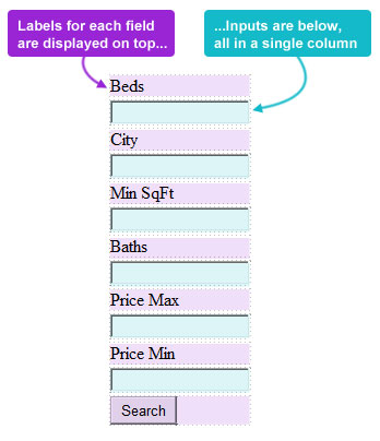
a single column IDX quick search
2 Column layout
By default, when you create a new quick search we’ll generate a form with a two column table. Each row has a single input field on the right with a matching label to the left. This is the most common option, as it’s clear, easy to read, but it’s still narrow enough to fit in the sidebar or similar column of any real estate site.
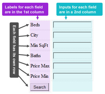
an IDX quick search with the default 2 column layout
4 and 6 Column Layouts
Both of these options just add additional pairs of columns to the 2-column layout. This layout is best for larger IDX forms that have lots of search fields.
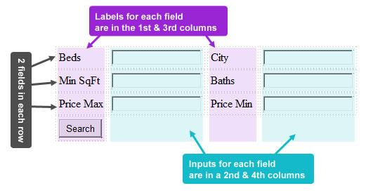
a sample IDX search widget with 4 columns
Unlimited Columns Layout
This layout will display all search fields and labels in a single continuous row with unlimited columns. This option is great if you want an IDX widget that will stretch across the top of your real estate site.
The choice you make for your Number of Columns in HTML Output setting will have a big impact on the HTML that is generated for your Quick Search IDX widget, so it’s worth your time to play with this setting before you dive into customizing your search further via CSS.
IDX Quick Search CSS Guide
Most of the HTML tags generated for our IDX quick search module have either a class, and ID or both that can be used to style your search via CSS. Here’s a rundown of the classes and IDs used…
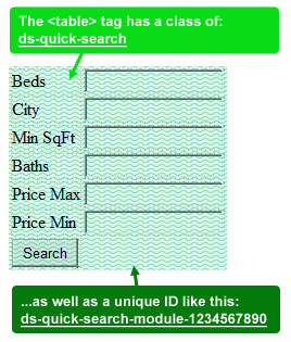
class and ID used for IDX module <table> tag
ID and class for <table> tag
Your entire IDX search module is generated inside of a <table> tag. You can control the size, color, font, and other styling for all elements in any quick search table using this CSS class:
.ds-quick-search
In addition, we’ll give your quick search table a unique ID, allowing you to make changes to each IDX module on your site. The ID will be in this format:
#ds-quick-search-module-1234567890
To retrieve the unique ID we assign to your table, you’ll need to add the module script to a page of your site, choose the “View Source” option in your browser, then simply scan the generated HTML for the <table> tag. Alternatively, you should be able to make CSS changes to your module using just the .ds-quick-search class alone.
Some suggestions would be adding a background image or color to your search widget <table> like this:
.ds-quick-search {
background-image: url(‘myimage.jpg’);
}
…or maybe add a border around the search:
.ds-quick-search {
border: 1px solid black;
}
…or you can go nuts and add styling to elements nested inside <table> the tag. Here’s an example that sets the width for all the <td> tags inside a quick search IDX widget:
.ds-quick-search td {
width: 200px;
}
Classes for search fields and labels
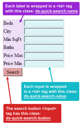
classes and IDs used for IDX fields
Each search field in your IDX module has one <td> for the field label, and a second <td> for its input. All the <td> tags that contain field labels use this class:
.ds-quick-search-name
…and all of the <td> tags with an input box/area use this class:
.ds-quick-search-value
Most CSS styling done with your IDX search module will involve these two classes. Here you can set the font, colors, font size, spacing, and more for your search form.
As an example, with the CSS below I’ve set the font type and font size, and added additional spacing between each <td> in my widget:
.ds-quick-search-name {
font-family: Arial;
font-size: 10px;
padding: 5px;
}
Additionally, you can make changes to the search button on your form using this class we assign to the <input> tag:
.ds-quick-search-button
You can use pretty basic CSS to change the font, background, or button style of your Search button, including hover effects.
You could even replace the search button with an image, but that’s a bit of a hack, so do that at your own risk.
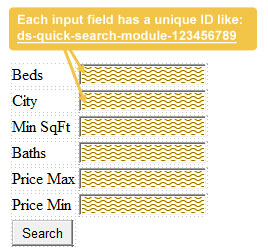
each search field has its own unique ID
IDs for each IDX search field
Lastly, each <input> tag in your search is assigned a unique ID that lets you control CSS styling for individual fields.
The field IDs are in this format:
#ds-quick-search-module-123456789
Just like the ID assigned to your <table> tag, you’ll need to view the original source to retrieve the unique IDs for each field you wanted to style via CSS.
These unique field IDs can be especially important if you want to make some field inputs (like beds and baths) smaller that others, or if you wanted to really highlight some IDX fields while leaving others less prominent.
IDX quick search widget styling guide re-cap
To re-cap, here’s how you can control the look of your IDX search widget:
- choose the right Number of Columns setting to fit the placement of the widget
- every field label is in a <td> with class: .ds-quick-search-name
- every input field is in a <td> with class: .ds-quick-search-value
- and every field <input> has a unique ID in this format: #ds-quick-search-module-123456789-1
- your entire search form is in a <table> with class: .ds-quick-search
- and your <table> also has a unique ID in this format: .ds-quick-search-module-123456789
As mentioned at the onset of this post, we do not provide support for this level of editing/customization… so edit your site’s CSS of your site at your own risk.
Our dsSearchAgent Quick Search IDX widget was designed to be plain enough to match the style of any site – we don’t expect average users to customize their quick search outside of our Control Panel options. However, if you or your designer or web developer are familiar with CSS, our IDX widget does include the tools for you to take advantage of.
As you should know, any CSS changes you make should go in your site’s CSS file, or otherwise the <head> tag of your site or the <head> tag of the individual page you are using the widget on.
Ok, that should help. For those of you know know what to do – go have fun making your quick search awesome!
[btw: If you have troubles customizing your widget via CSS, our support dept won’t be able to help you. Sorry. This is a “hidden feature” that’s there for you to use if you know what you’re looking for, but it’s not something we generally promote.]

