How To Grab Attention With Your Website’s Home Page Navigation
You have about 2-3 seconds to grab a site visitors attention when they come to your website. Within those initial 2-3 seconds, they’re going to decide whether they trust you…
Is your site easy to navigate? Or is it just a bunch of clutter…
Do you cover my market area? In other words, can I find what I’m looking for here?
Is the information up-to-date and reliable?
Within those first 2-3 seconds, they’re going to decide whether or not your website has what they’re looking for. So you need to make sure that you’ve done everything you can to effectively grab their attention, and keep it so that you can convert them into clients.
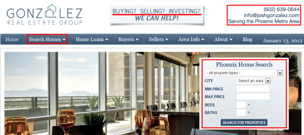
Here’s an example of a well crafted home page/header design and a few key things to consider…

1. Be concise.
Describe who you are, what you do, and what you offer in as few words as possible.
Here, I think Josh knocks it out of the park. Here’s how:
- Great, simple logo.
- I can tell that he works with Buyers, Sellers, and Investors.
- There’s a clear Call To Action (and contact info) right on the home page, right above the fold.
Your site needs to quickly communicate who you are, what you do, and what area(s) you service.
2. Stay above the fold.
One of the primary reasons consumers are coming to this site, is to search for homes. There’s two prominently placed locations for me to do that:
- In the header navigation under the “Search Homes” tab.
- On the quick-search form to the right.
Notice that both items are placed prominently above the fold so it’s the first thing site visitors see when they land on the page.
3. Provoke a Call To Action.
There’s two things you want site visitors to do to convert them into clients:
- Call or email you.
- Register to use the IDX search on your website.
Here, Josh provides both quickly and easily. Notice the phone number and email on the upper right-hand side of the site. That’s on every single page of the site so whether you’re looking at a blog post, or reading a listing details page, when you’re ready to ask a question about a property, you can quickly access the phone number to call.
And if you’re not that far along in the process yet, well, you can easily conduct a new home search by using the Quick Search form placed prominently on the home page. You don’t have to struggle to find it, it’s just there.
What do you think? Did I miss anything? What else could you improve in order to effectively grab your reader’s attention and convert them?
