IDX quick search done right and other tips
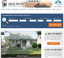
 Getting buyers to engage with your IDX search can be difficult. Your site needs to call attention to your search features, get visitors to perform a search, and ultimately register as a lead; so for this month’s client spotlight, we found a client whose IDX search does it all and makes it look easy: Tom Lipinski. Focused on Lake St. Clair real estate, Tom’s website http://lakestclairlife.com offers a perfect example of incorporating search features that engage buyers and capture leads.
Quick Search IDX Form
The IDX search form on Tom’s site is fantastic. I’ve broke his search down piece-by-piece below to bring to light all the small details that make his search a success.

Easy to find
Huge and showing up on every page, his IDX search is easy for visitors to find. Additionally, the search container has a bright background color and over-sized magnifying glass icon that helps the search stand out on any page. IDX visibility is super important for visitors who don’t land on your homepage or otherwise want to start a new search from your other site pages.
Fill-in-the blanks form
Mad Libs-style inputs help make the IDX form feel more personal. By simply adding “I would like to see homes that are…” the the start of the search form, Tom encourages visitors to fill in the blanks to finish the sentence. Mad Libs-style fill-in-the-blanks web forms have become a recent trend due to the higher user conversion seen with this format. Visitors see the “I would like to see homes…” prompt and feel compelled to fill in the rest – – a very effective format for engaging home buyers.
Call to Action
 The last part of his form that makes it really stand out is an oversize “SHOW ME NOW” search button. The size, color, and verbiage of this button all urge the visitor to perform an action. In this case, the action is to see homes. SHOW ME lets users know they will see homes that are personalized for them, and NOW creates both a sense of urgency and lets buyers know the goods are just a click away. Additionally, the button is over twice the size of any other button on the page, in a color that stands out against its surroundings.
Getting visitors to find your search (or any other MLS functionality) is just the first part of the equation, but Tom’s site makes his IDX both easy to find and engaging – – ensuring users will perform searches on his site.
How to Recreate
Tom’s is using a custom site from Virtual Results – and they customized our search module for him – but here’s how you can incorporate some of the same tricks on your site.
To start, log in to your dsSearchAgent IDX Control Panel and go to the Module area to create your Quick Search…
1. Use the “unlimited” columns option when you create your module. This will ensure your search fields are all lined up into a single, horizontal row, which is ideal if you are going to use you search across the top of your site.

2. Use color to make it stand out. When you add to your site, place your module in a container (such as a DIV or TABLE) with a background that is different from the rest of your site – or at least different from the rest of the items that the search will sit next to. Ideally, something bright that still coordinates with the rest of your site – you want your search to stand out and catch users’ attention, not stick out like a sore thumb.
3. Use on every page. Add the module to your site header or other area in your site admin that will repeat at the top of every generated page. It’s important to remember that not all visitors will enter your site from your homepage – so any page that home buyers may land on should offer a clear way to search listings.
4. Add a prompt. Add text above your module prompting users to perform a search, such as “Find homes in the Phoenix area now…” or “Start your search in…” etc. Pose users a clear question they’ll want to answer or an idea they’ll want to engage with.
5. Customize your search button. This one is a little trickier, as it requires some CSS expertise. For those of you familiar with CSS, or wanted to have custom work done by a programmer, the “Search” button in our modules use the class “ds-quick-search-button”. You can use CSS to alter the color and size of your search button; or you can replace it with a different button image altogether.
Custom IDX Results Page
 Tom’s created a custom page to display the property results of an IDX search. Anytime a user performs a search from his quick search module, they get taken to a custom results page with some great features worth checking out…
Social sharing buttons
Facebook LIKE buttons, Twitter options, and other social sharing tools at the top of the search page make it easy for visitors to share links to the search page, or otherwise save the search page for later viewing.
Why Register? link
A Why Register link at the top of the search results opens a page explaining the hows and whys of registering for the property search.
It’s important to remember not all visitors are familiar with the term “MLS”, and even fewer will know what “IDX” means. A page explaining the source and types of listings found on the site, stressing how great the search is and all the benefits of registering, can really improve your registration and help you gain trust with your users. As an end user, I always appreciate the extra step like that gives context to and explains the value of website registration.
This link is especially important for Tom’s site because he is using…
Forced registration
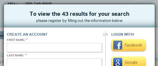
Tom restricts his users to only three search result page views. If visitors want to perform more than three searches or view the details for any listing, they must register. Our blog has always stressed how forced registration like this is the best way to ensure you’ll capture IDX leads on your site.

How to recreate
1. Create a page specifically for search results. This can be your normal framed IDX search page or a page dedicated for searches performed with your IDX search module(s). Either way, grab the Frame HTML code from your IDX Dashboard and add it to a page of your site (such as: realtorjoe.com/st-clair-real-estate-search-results.htm).

2. Tell us where the page is located. Once you have a page setup for your search results, tell us the exact address of your custom page on the Domains tab of your IDX Options.
If setup correctly, anytime someone uses one of your IDX modules they should be directed to your custom page to view their search results. Now you can…
3. Add social sharing options. If you’re using WordPress, there are many social sharing plugins that make it easy to add Facebook, Twitter, and other sharing buttons to your page. Otherwise, Facebook and other sites offer easy to copy-and-paste code snippets for adding each of their buttons. You may want to add an extra note like “Share your Lake St. Clair search with your friends!” to further encourage the use of these buttons. Additional tips on adding sharing buttons to your page are available here.
4. Tell people why they should register. Add a note to the top of your search page (or a link to a new page) explaining why visitors should register. You can use this opportunity to “sell” buyers on why your IDX and your site are the best, what buyers and sellers can expect to find using your site, how to use specific search features, and what features they’ll unlock once they register – – not to mention what an awesome agent you are for providing all these free tools to your users.
5. Force registration. Edit the settings on the Registration tab of your IDX Options and be sure your users are forced to register at some point while using your site. It may seem invasive, but it’s the only sure-fire way to see great returns on your IDX.
